At Exalate, we’re committed to helping shape the future of work by leveraging powerful software integration to maximize cross-team and cross-company collaboration.
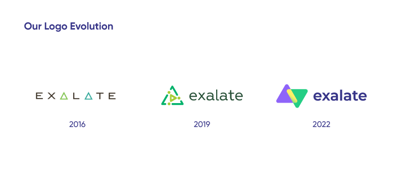
As part of that commitment and yet another step on our journey, we have some exciting news to share: we’re launching our new brand identity. We revamped our entire visual expression, including a new logo, colors, icons, and typography.
Exalate’s new branding unites and syncs what we do and value, and sets the stage for what’s coming next.
Our Vision & Mission
Over the past 6 years, Exalate grew from a small team to a team of +65 dedicated integration experts, coming from over 25 different nationalities and working from all around the world. We now have a partner network of over +150 firms and +1600 international customers who trust our product and expertise.
Having grown significantly since Exalate’s launch, we now have even more ambitious plans and goals for the future, and we naturally need more power to put them into action. We simply felt we had outgrown our early appearance.
We’re at the forefront of technology innovation and the creation of a new category, cross/multi-company integrations, which may impact how businesses collaborate globally. It’s no secret that we have big goals—we are building a worldwide network of connected companies working together in a structured manner.
As we continue to grow and evolve, we’re introducing the elevated Exalate brand that feels authentic to who we are, with influence and inspiration from the entire team and our customers.
The rebranding of Exalate represents our long-term approach to fostering better collaboration, building a network, and connecting people, teams, and companies.
Our global culture, innovative mindset, and limitless potential are all expressed in this design.
The Exa Vibe: Culture and Values
How do we know we’ve grown as a company and culture? We’ve become more daring and seek out challenges; we try less and trust more; and we know when to delegate power and when to take bold action. Most importantly, we understand that making mistakes is not only okay, but also needed to keep growing.
Our multicultural and remote-first setting fosters powerful ideas and great teamwork. The people of Exalate welcome creative approaches, fresh ideas, and forward-thinking.
We strengthen what unites us, yet we celebrate what makes us different.
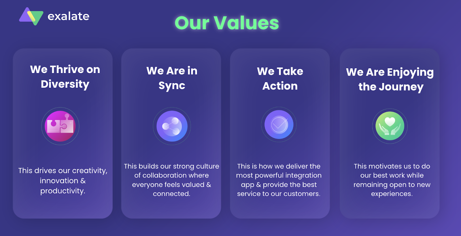
Our values are at the heart of our new brand – it’s about authenticity, owning our story, and being proud of our strengths.
The Strategy and Creative Process
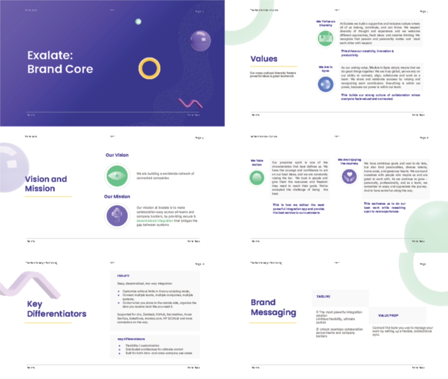
Before the actual design process, we started with a thorough research. After months of exploration and strategy meetings with the team, we first defined the essence of our brand. Not only our vision, mission and values, but also how we aim to communicate it to the world, who we are and who we want to become.
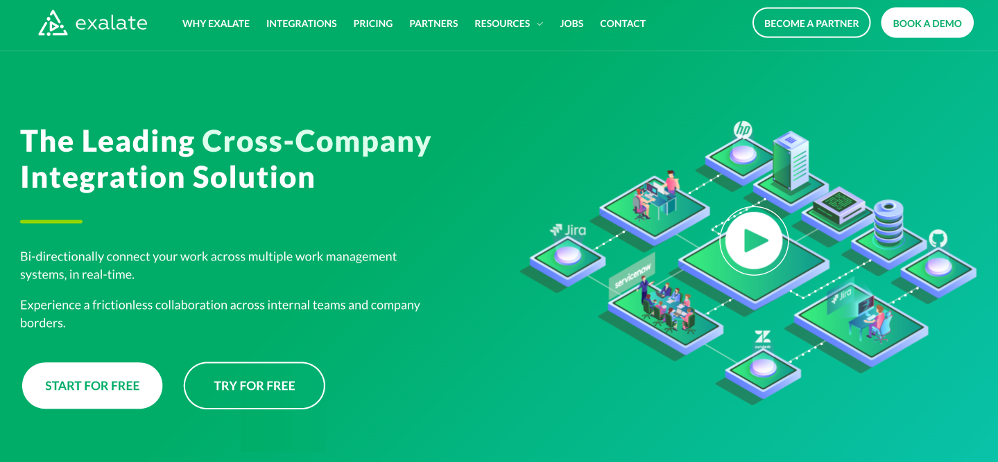
With that in place, it was time to look at our visual identity. Did that never-ending-kinda-boring-green truly represent us? As you might imagine, the answer was no.
But don’t get us wrong, that brand served us for many years, but it just simply wasn’t Exalate anymore. We had grown out of it and were ready to become brighter, bolder and even more diverse.
Brand New Colors
Color is an integral part of our evolving brand image. The driver behind our new palette is to make sure that our colors show what our brand is all about.
Our new colors portray the character of our brand along with the charge that we want to express.
This design represents our global culture, innovative mindset, and limitless potential.
Using a vibrant attitude and dynamic presence, our new color palette bridges the gap between before and now, encouraging action, collaboration, and confidence.

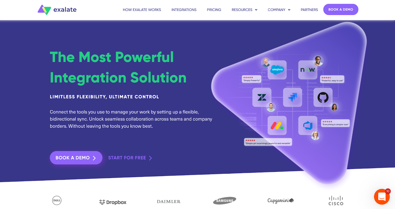
Green and purple are the highlights of our new palette – these are our main colors. Contrasting enough to show our bolder side, but still amazingly harmonious and comfortable to the eye. Yellows, pinks and blues are added as our accent colors.
All together, they give us unlimited possibilities.

The New Exalate Logo
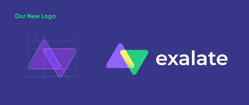
Our new logo represents connection and integration – The BIG idea that drives our entire approach. But with the new design, the intersection between the triangles, alongside our new colors, makes the integration more alive, vibrant, and bold.
It also signifies a feeling of unity and embodies the principles of sync, such as balance, consistency, and communication.
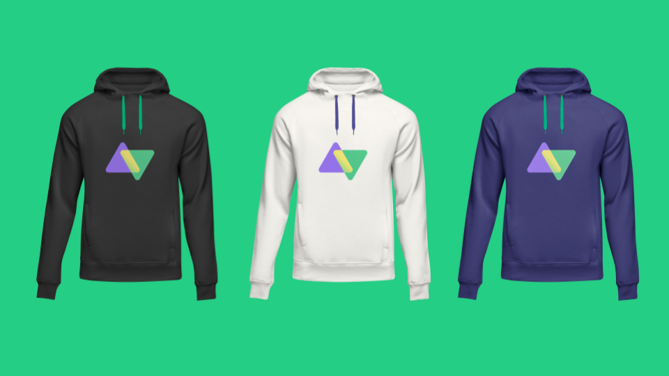
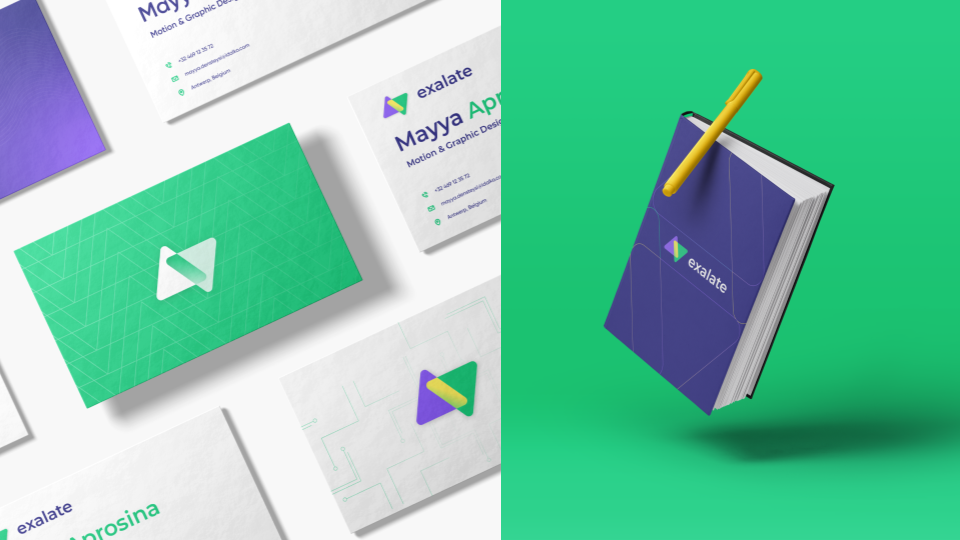
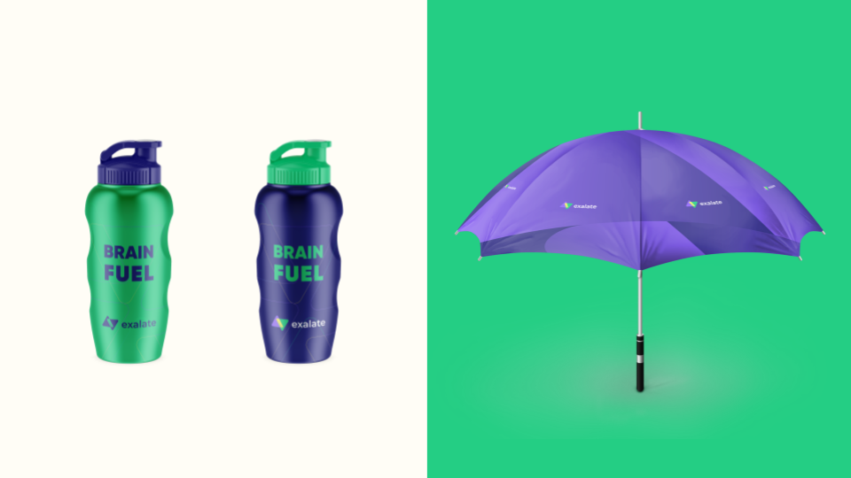
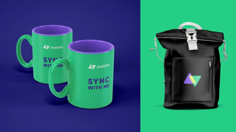
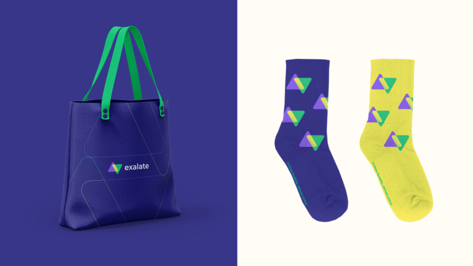
A Sneak Peek at our New Swag
The Product
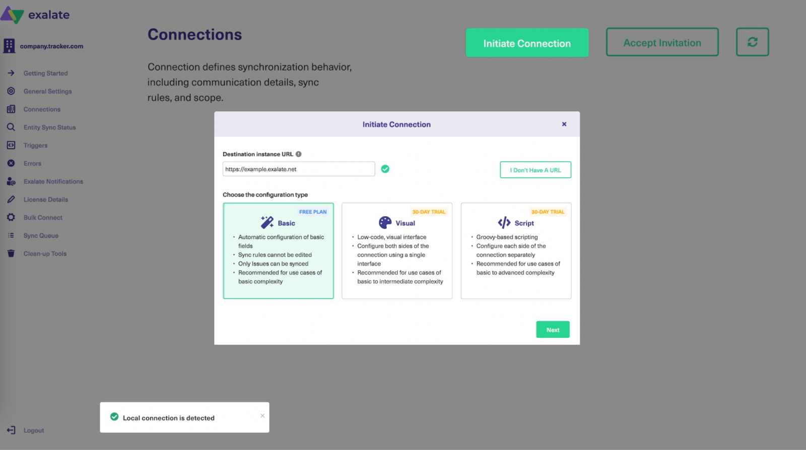
Along with the new look and feel of the Exalate website, the product interface has also been rebranded with the fresh bold colors to keep everything in sync. We aim to improve our customers’ experience as we grow and we believe the new brand resonates more with what we value the most.
But that’s not all!
We embrace change and we are ready for whatever challenge that is on the way. So since we are aware that the user experience is closely linked with our documentation, we decided to revamp it completely to meet our customers’ requirements and to make their experience much smoother.
It is of course an ongoing process as it is based on the user feedback but new flows are already in place, which is more in sync with the product and the user journey.
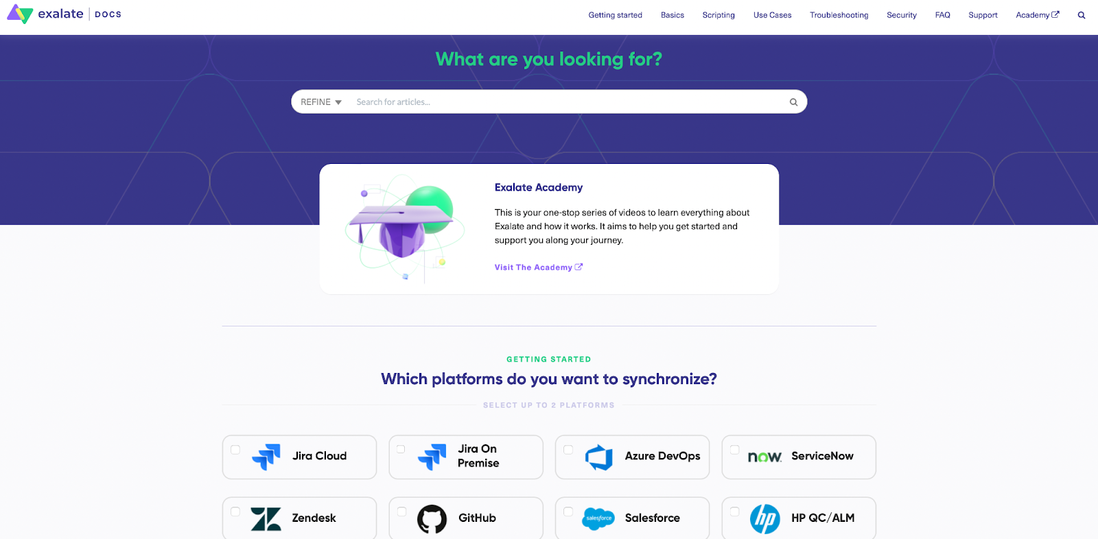
Check out Exalate’s new documentation.
By rebranding, we set the bar higher, pushed ourselves to think bigger and opened up new possibilities.
Exalate initially started as a Jira sync app, connecting two instances. It then grew fast into a solution that integrated multiple instances across a variety of platforms.
And now it is time to create a network of connected companies to facilitate collaboration outside company borders and to keep the work in sync.
As we pursue Exalate’s ambitious vision and expand rapidly, our team remembers to enjoy and appreciate the journey. And to have some fun along the way.
We hope you like our brand new look!